Thursday, 12 November 2015
Wednesday, 11 November 2015
AS2 Task 4- Be able to produce a television ident to a brief
In this unit I have been talking about idents and in this post I will be talking about how I came up with the idea for my ident and what I did in the production phrase to ensure that it was completed.
In the production phrase I had to make sure that the ideas that I was thinking of would be suitable for the selected channel so that it would okay for the intended audiences, after I had thought of all that I would then have to try and figure out what the whole idea of the ident was going to be, to keep it simple I had an idea to make it wither out of numbers or letters. After I had finished doing that I then had decided that doing numbers would be easier so I started to plan how it would be or how it could be with 3 different storyboards with 3 different ideas and times of years and times of day such as a morning, afternoon and a night time one. After i had made the storyboards i then made a decision for the one that I thought was the easiest/best one to make, after i had made the decision on which one that I was going to do I then started the process of making everything that I needed in order to make the ident.


In the production phrase I had to make sure that the ideas that I was thinking of would be suitable for the selected channel so that it would okay for the intended audiences, after I had thought of all that I would then have to try and figure out what the whole idea of the ident was going to be, to keep it simple I had an idea to make it wither out of numbers or letters. After I had finished doing that I then had decided that doing numbers would be easier so I started to plan how it would be or how it could be with 3 different storyboards with 3 different ideas and times of years and times of day such as a morning, afternoon and a night time one. After i had made the storyboards i then made a decision for the one that I thought was the easiest/best one to make, after i had made the decision on which one that I was going to do I then started the process of making everything that I needed in order to make the ident.


Tuesday, 10 November 2015


Friday, 6 November 2015
AS2 Task 2- Designing the suite
From the mind map that I had completed I decided to choose the 3 best ideas that was there, from these 3 ideas i had to choose the one that was suitable for the channel chosen, how it would appeal to the target audience that has been chosen and is also linked to that channel and i had to try and take into account what time this would be played from the time of year and also the time of the year because of the weather.
These ideas are suitable for the channel because they are all used with numbers and letters so it is simple enough for the target audience to understand it and it is all animated so it is also suitable because there is nothing rude that happens in it, these idents where all designed to be based around spring summer time.


These ideas are suitable for the channel because they are all used with numbers and letters so it is simple enough for the target audience to understand it and it is all animated so it is also suitable because there is nothing rude that happens in it, these idents where all designed to be based around spring summer time.


AS2 Task 1- Ideas generation
When I create my ident the theme could all be used in different ways, such as, if I chose to do one in the winter it would most likely involve the weather been cold and having snow but if I chose to do one in the summer it could either involve having a pool and having water splashing or I could keep it simple and have it so that they are just running around. I've chosen to go with numbers and letters because it is simple and when it comes round to doing it for children it is easy enough for them to understand so it isn't too much for them to understand so it fits in to who I want it to appeal to.


Tuesday, 6 October 2015
Task 3- understanding the design of a suite of television idents
The theme of this BBC ident is Christmas, this ident appeals to it's viewers who are mainly children by showing the Gruffalo which is featured in a children's TV show. In this ident they have used the same theme as they always do but they have done it in a different way, they have used a different background to what they normally do and they have also created the circle from when the Gruffalo went through the snow ball. This ident was made more for entertainment because there is no information that is been said in it and it is also animated for because it is aimed at children and this ident is should be used for Christmas time and during the day. The suite can convey an identity that everyone is able to recognise and it can also convey that one thing is always the same but everything else is different which makes it more interesting and viewers don't get bored of seeing the idents because there is a variety. This design suite is effective in the eyes of children because it is a fun animation for them to see and it is also advertising that it is coming to the Christmas period and a normal ident would last roughly 30 seconds but if there is a gap that needs to be filled before the next show comes on then they would play the ident until it is time for the show to be shown again.
This is a ident created by the BBC to advertise something that was going to happen in a TV show, this theme may appeal to viewers who watch Eastenders because it is letting them know that there is something going on in that show and it is trying to create tension to make people want to go and watch it. They have used the same way but different in this case because when they move the camera further out you still see a circle which then the BBC 1 logo appears right in the centre of it. This ident would be entertainment based rather than information based because it does not provide any information to those who see it. This ident would only be used around the time of the show that it is meant to advertise for which is usually 7:30 PM and there wouldn't be a specific time of year that they could show this but because of what they are wearing it would probably be around Autumn time, this suite would convey that this is the channel that shows this TV show. This design suite would only be effective been shown around the time of the TV show that it is advertising for and this would only last around 30 seconds.
The theme of this ident is football, this theme would appeal to some viewers because it is seen as something different to what they are usually used to seeing and it would also appeal to those who are football fans. They have used the same theme but differently by placing footballers in a circle and making them kick the ball and then they place the BBC 1 logo in the center of the footballers. This ident is entertainment based because there isn't information that is given to the public and this is only used to try and fill a time gap. I think that this ident would be used during the day and if there was to be a specific time of year that it would be shown I think that it would be around spring time. This ident would convey that this channel has a variety of channels and their shows are intended for everyone and it could also convey that they understand that they have a broad range of viewers that watch things on that channel. This ident could be effective for a time because it is something different to all the rest of the idents that they have produced and it could also be seen as not very interesting because it deosn't appeal to everyones taste and this ident lasts around 30 seconds.
BBC have created a successful ident suite because it can always be changed to fit anytime of year and the BBC logo that appears inside the circle has been created with thought because it does not offend anyone and it doesn't imply that it is for a specific gender, it has been created with thought because if there is a large time gap then the ident can continuously be played to drag out the time that needs to be filled up until the the next show is then shown, it can also be shortened if it needs to be if there isn't enough time to show the whole ident.
Tuesday, 15 September 2015
Task 2- Understanding the limitations of the television ident
In television there can be many different limitations that could either be a positive or it could end up posing as a issue, there are a few things which could be considered a limitation those are typography, colour, aspect-ratio, adhering to a desired tone and duration.
Typography
Typography is an art and technique of arranging type to make written language legible, readable and appealing when displayed, it involves selecting typefaces, point size, line length, line-spacing, letter spacing and adjusting the space the space within letters pairs. The term typography is also applied to the style, arrangement and appearance of the letters, numbers and symbols created by the process, type design is a closely related craft, sometimes considered part of typography; most typographers do not design typefaces and some type designers do not consider themselves typographers.


Colour
Colour is the visual perceptual property corresponding in humans to the categories called red, blue, yellow etc, colour derives from the spectrum of light interacting in the eye with the spectral sensitivities of the light receptors. Colour categories and physical specifications of colour are also associated with objects or materials based on the physical properties such as the light absorption, reflection or emission spectra.

Aspect ratio
The aspect ratio is the dimensions required to fit the screen, the aspect ratio is expressed as two numbers separated by the colon (x:y), the values of x and y do not represent actual width and height but rather the 'relation' between width and height, for example 8:5, 16:10 and 1.6:1 are all the same aspect ratio.

Adhering to a desired tone
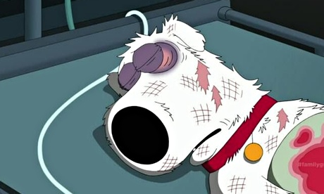
The ident for each individual channel has to be able to correspond with the channel's genre or style, for example BBC two has a formal ident for the shows that it provides such as documentaries but BBC three has a comical animated ident to reflect on its humorous shows such as Family guy or American Dad. The right tone needs to be set for the different target audiences, it has an important goal because the tone has to be suitable for the intended audience.
Duration
Duration is the amount of time between two different events it could also be the length of time it takes for something from start to finish.

Typography
Typography is an art and technique of arranging type to make written language legible, readable and appealing when displayed, it involves selecting typefaces, point size, line length, line-spacing, letter spacing and adjusting the space the space within letters pairs. The term typography is also applied to the style, arrangement and appearance of the letters, numbers and symbols created by the process, type design is a closely related craft, sometimes considered part of typography; most typographers do not design typefaces and some type designers do not consider themselves typographers.
Colour
Colour is the visual perceptual property corresponding in humans to the categories called red, blue, yellow etc, colour derives from the spectrum of light interacting in the eye with the spectral sensitivities of the light receptors. Colour categories and physical specifications of colour are also associated with objects or materials based on the physical properties such as the light absorption, reflection or emission spectra.
Aspect ratio
The aspect ratio is the dimensions required to fit the screen, the aspect ratio is expressed as two numbers separated by the colon (x:y), the values of x and y do not represent actual width and height but rather the 'relation' between width and height, for example 8:5, 16:10 and 1.6:1 are all the same aspect ratio.
Adhering to a desired tone
The ident for each individual channel has to be able to correspond with the channel's genre or style, for example BBC two has a formal ident for the shows that it provides such as documentaries but BBC three has a comical animated ident to reflect on its humorous shows such as Family guy or American Dad. The right tone needs to be set for the different target audiences, it has an important goal because the tone has to be suitable for the intended audience.
Duration
Duration is the amount of time between two different events it could also be the length of time it takes for something from start to finish.
Positive limitations
Duration
length of a advert which introduces the shows that are later on in the day, this becomes beneficial as it gives the audience an insight to the shows they are going to show and it prolongs the visuals of the ident.
Typography
There are many positive aspects to typography such as the cross-platform compatibility, variety of characters in a single font file and unique typography features, typography is extremely important to clearly state information, to communicate amongst one another or to create an attraction to the viewers.
Colour
Although there are colours that have allocated to channels, for example a distinctive pink is used for BBC three so it is unusable by any other channel, the remaining colours to choose from for your ident is still a massive selection.
Size
Having limited space to display your ident on a screen is a debatable limitation, however using the space and size to your advantage, you can create an ident displayed for a short amount of time and position everything so it is visible and clear to the audience, for example a channel may place the ident, the channels on next and a interesting activity in the background in one ident and this will all be sizably fit to be on TV.
Subscribe to:
Comments (Atom)