Typography
Typography is an art and technique of arranging type to make written language legible, readable and appealing when displayed, it involves selecting typefaces, point size, line length, line-spacing, letter spacing and adjusting the space the space within letters pairs. The term typography is also applied to the style, arrangement and appearance of the letters, numbers and symbols created by the process, type design is a closely related craft, sometimes considered part of typography; most typographers do not design typefaces and some type designers do not consider themselves typographers.

Colour
Colour is the visual perceptual property corresponding in humans to the categories called red, blue, yellow etc, colour derives from the spectrum of light interacting in the eye with the spectral sensitivities of the light receptors. Colour categories and physical specifications of colour are also associated with objects or materials based on the physical properties such as the light absorption, reflection or emission spectra.

Aspect ratio
The aspect ratio is the dimensions required to fit the screen, the aspect ratio is expressed as two numbers separated by the colon (x:y), the values of x and y do not represent actual width and height but rather the 'relation' between width and height, for example 8:5, 16:10 and 1.6:1 are all the same aspect ratio.

Adhering to a desired tone
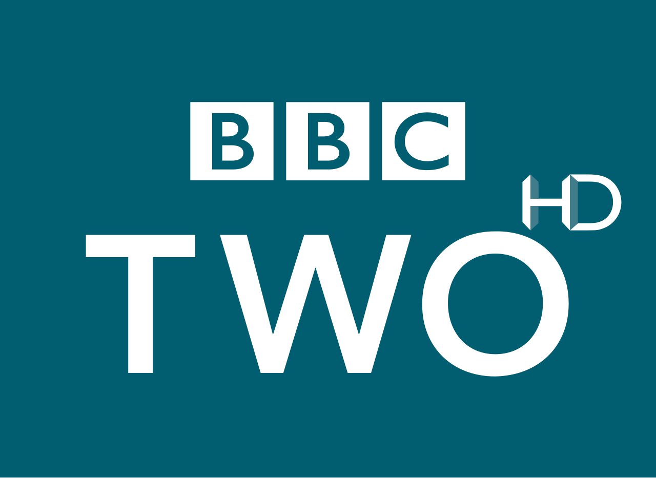
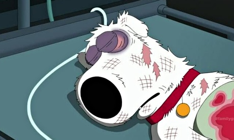
The ident for each individual channel has to be able to correspond with the channel's genre or style, for example BBC two has a formal ident for the shows that it provides such as documentaries but BBC three has a comical animated ident to reflect on its humorous shows such as Family guy or American Dad. The right tone needs to be set for the different target audiences, it has an important goal because the tone has to be suitable for the intended audience.
Duration
Duration is the amount of time between two different events it could also be the length of time it takes for something from start to finish.

Positive limitations
Duration
length of a advert which introduces the shows that are later on in the day, this becomes beneficial as it gives the audience an insight to the shows they are going to show and it prolongs the visuals of the ident.
Typography
There are many positive aspects to typography such as the cross-platform compatibility, variety of characters in a single font file and unique typography features, typography is extremely important to clearly state information, to communicate amongst one another or to create an attraction to the viewers.
Colour
Although there are colours that have allocated to channels, for example a distinctive pink is used for BBC three so it is unusable by any other channel, the remaining colours to choose from for your ident is still a massive selection.
Size
Having limited space to display your ident on a screen is a debatable limitation, however using the space and size to your advantage, you can create an ident displayed for a short amount of time and position everything so it is visible and clear to the audience, for example a channel may place the ident, the channels on next and a interesting activity in the background in one ident and this will all be sizably fit to be on TV.
